Saturday, November 2, 2013

Paradise Found

Paradise found

This week I read an article in Architectural Digest one of the homes of my doppelganger Cindy Crawford (She wishes)!
It seems miss Cindy has great taste not only in clothing but her interiors.  She and her entrepreneur husband Rande Gerber decided to partner up with George Clooney and build a sort of compound  or side by side home if you will for themselves when they come to visit the small town of Los Cabos, which just looks like paradise on the southern tip of the Mexico's Baja peninsula.  The group agreed that they wanted to stay away from the typical "hacienda" style homes that you commonly see.  This home is much more modern and one of the most serene homes I've seen with incredible exotic, warm wood coffer ceilings and open to the elements wall concepts. You enter into a double height central courtyard with Spanish Limestone on floors and walls and exposed to the elements. The colors are very neutral, but you don't need a lot of foof when you have views with spectacular turquoise waters and lush palms and other vegetation right out your door and even on your lanai as your decoration.  You can see that the space was designed for entertaining with so many spaces for gathering, the compound is named Casamigo's which means "house of friends".  
George did agree or entrust Rande and Cindy to make the majority of the design decisions knowing that they do have an eye for design as well as impeccable style.  They worked with a local architect, Ricardo Legorrita and son Victor Legorrita.  This home is stylish, bright, warm and welcoming just like you want to feel when you come home or enter into your vacation home.  
Enjoy these pictures of Casamigo's.


All of the pictures came from the November issue of Architectural Digest Magazine


Tuesday, October 22, 2013

Fall Centerpieces

Centerpieces for the Season

I read an article in Better Homes and Gardens October issue on tablescapes and centerpieces.  The article is called "Natural Genius".  It's about not spending a lot of money to make your table look pretty but using the natural resources we have available to us right outside our doors.
 I'm sure most of us have something on our dining tables whether it is just place mats, table runners, a tablecloth or a plant in a vase.
 To me, a centerpiece is like jewelry, you always want to accessorize and yes, you should always have a some sort of dressing on your tables, we're designers, of course we're going to accessorize.

Even though summer blooms are gone, painfully obvious from today's snow, you can still create a beautiful and low to no cost tablescape just by simply looking around your yard.
You will need some items like; spray paint, (gold and silver are great for this time of year), unique looking urns, wicker bowls, vases you don't mind altering, mason jars and even old glasses that you never use.  Just give them a good wash, and start getting creative.  Here are some great examples of tablescape options and accessories.

We all have leaves in the yard...here is a great way to use them as decoration for a table centerpiece

www.bhg.com


This stuff is free people!  it's right out your door

www.bhg.com


Leaves, gourds, acorns, pine cones, and candles and you've got a great tablescape

www.bhg.com

Maybe reconsider throwing out that old sweater, how sweet is this little tea candle holder with some of that fabric to warm up that little vignette.  

www.houzz.com


Get some gold spray paint and go nuts!


This is a throw blanket, cut up some burlap, sticks, candles and voila!  How clever
www.houzz.com

www.bhg.com


www.pintrest.com


How about this...who would've thought pumpkins could be so elegant.  Decorative nail heads and your initial, very nice.
www.houzz.com


Go to your grandmother's basement, she's got these mason jars in all shapes and sizes and if she doesn't....I do!  Come ask me for some:)
www.houzz.com


this reminded me of Natasha's table centerpiece just a touch. This is just a cool branch that fell from the tree spray painted white.   

www.houzz.com

I hope these idea's inspire you to create a one of a kind and very inexpensive tablescape that you can change out every other week if you're so inclined.

Tuesday, October 15, 2013

Modern Twists

Happy mid-week to you all!
 
I read an article in Trend Ideas magazine this week on one of my favorite design styles... modern design.  What I love so much about being able to use modern elements with any design style is that it can feed all of your style cravings, from rustic woods paired with shiny surfaces to arabesques etched in a modern glass panel.  Speaking of cravings, I've got some delicious kitchens to show you!
 
The article is all about kitchen's that have been remodeled.  The article, Modern Outlook talks about remodeling an old loft kitchen, ripping everything out down to the studs and starting with a clean slate.  Modern design is often times much more expensive than other styles because the materials you're using are going to be, well...modern...new.  There are those modern designs that encorporate classical elements and I think that is where the magic happens. 


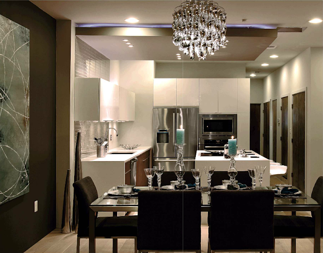
The linear lines attract your eye to all of the interesting levels and layers of what could be a fairly boring kitchen if it were just your typical beige kitchen.  The backlit drop ceiling provides deliniation of the one big expanse kitchen/dining combo.
 
There are plenty of reflective surfaces that help bounce the light around.  The rich wood warms the space under the waterfall countertops.


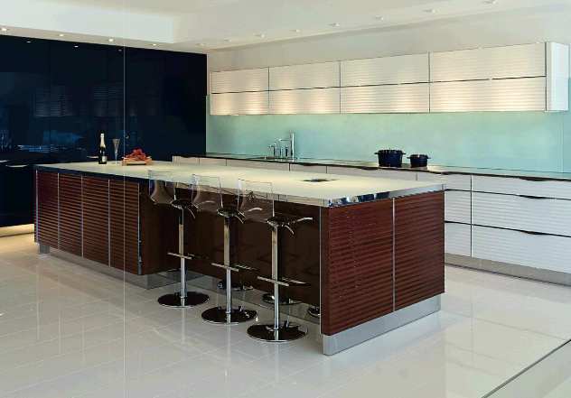
The next kitchen space is full of hidden compartments where your practical day to day kitchen tools are concealed with back lit lacquered cabinetry.  I love the stainless toe kick, the bands around the countertop and cabinetry


I love the idea the designer had here to encorporate a little bookcase nook for collectables and even cook books.  These are a java stained quarter sawn wood cabinetry with 3 form panels for doors that actually do open up for storage.  


Here is a view from the dining area, so as you can see, every ounce of space has been taken advantage of.  I love the stainless "island"


The below pic shows a beautiful modern kitchen with an element of classical, the herringbone pattern plank floor.  No, those are not modular or movable walls, it's a small galley behind the stove.


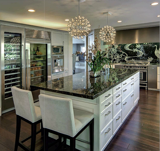
The Moooi LED pendants in this lovely remodel below cost between $3,000-$4,700 each pendant depending on the size.  The Sicis backsplash is more of a work of art than mosaic tiles, this backsplash alone I would estimate to be around $15,000 alone.  I love how they've used three different countertop surfaces, stainless on the range wall, a light granite on the perimeter and a beautiful dark granite on the island.  All of these luxurious elements of this design make you want to gather around and never walk away.


Tuesday, September 24, 2013

Rivetting


My blog this week in on Rivets.  I read an article in the October issue of Elle Decor magazine and it talked about what is trending for fall.  Rivets are trending in all things interiors from furniture to wall covering.  Here are a few examples of interiors with rivets
 
Source for pictures below came from my houzz.com account


Tuesday, September 10, 2013

Design Diva Dorothy Draper

  As we interior design students study the history of decorative arts, we've traveled through endless pages of beautiful pictures and museum sites that show the innovation of classical Greek to French Baroque and now American Federal interiors.  I was researching designers for this weeks blog and I came across this picture of the writing room at The Greenbrier Hotel in W.Virginia
 
We are studying American federal and this beautiful Girandole mirror grabbed my attention immediately. I knew I better get to know Dorothy Draper a bit better! 
 
 So, Who is Dorothy Draper?


In 1886 Dorothy Tuckerman was born in Orange County, New York (Did you know the East Coast had one of those?) 
 Dorothy was born to a very affluent family in fact she was raised in the very first gated community in America.
Her Great Grandfather, Oliver Walcott, signed the Declaration of Independence.  She also had famous cousins, Eleanor Roosevelt and fellow female designer Sister Parish.
Dorothy had very little education, however, she learned all she needed from her extensive travels to Europe.
Dorothy married a Doctor in 1912 and the glamorous life just continued.  She began her career by decorating her own homes and then opened her own decorating business in the roaring 20's.  Although Dorothy's marriage failed, her decorating career exploded.  She desired more, she craved bigger and better projects for herself and she made it happen. She was  commissioned to remodel the Carlyle Hotel lobby 
 
 
Neoclassical, nothing too terribly bold but very beautiful.  Just wait though, you ain't seen nothin' yet!
Dorothy became a household name for post war households when she started writing decorating advise columns for Good Housekeeping Magazine.  This 6' tall boisterous woman was not just going to view the world, she was going to put her own stamp on it.  Here comes printed chintz, big bold stripes and color combinations the nation had yet to see.
 
above s the Greenroom in L.A.


Wow, look at the bold colors and patterns and scale...Dorothy took scale to a whole new level in the playing field. 
This is the Greenbrier Hotel and a classic Dorothy Draper design with signature black and white checkered floors, with pops of turquoise, greens and reds.  This hotel was used as a military headquarters and hospital before Dorothy created this lavish lobby.
 
 
Can you imagine Dorothy Draper envisioning the massive stripes, questioning whether or not she should, then being confident enough in her design to give the green light...go ahead boys, stripes it is!  Amazing.  What about all the patterns?  This is why Dorothy Draper was a diva. And peekaboo little pink sofa, I see you too back there.
 
 
This is Quitandinha Palace. 


http://www.nytimes.com/2007/04/18/arts/design/18wing.html

This is the restaurant at the Metropolitan Museum in New York that was coined the "Dorotheum".


Fairmont Hotel in San Francisco
 
Her designs incorporated lots of classical and baroque elements on monumental scale.  Media called her style Modern Baroque. 
Who was Dorothy Draper?  She was a pioneer of design and decoration, She is still today an inspiration to many designers that followed.  It is evident in Kelly Wearstler's bold floor patterns and color layering, it's evident in Billy Baldwin's use of printed chintz and many other forward thinking designers.  I can only dream that one day I too would be bold enough, innovative enough to design a project that would go into the history books.