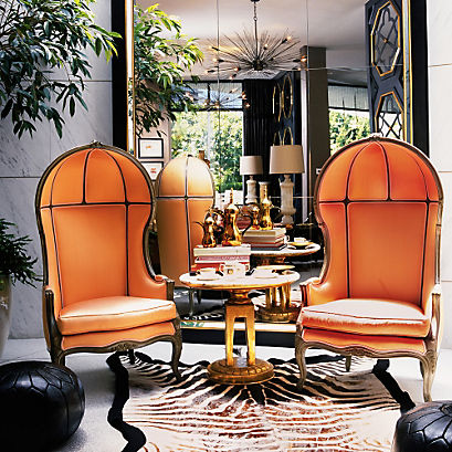
Kelly Wearstler
I immediately knew the Designer I wanted to write about. I’m so drawn to Kelly’s eccentric design style because she is fearless with her designs. Her philosophy is
“Take Risks” and she does.
I went through some of my magazines and noticed I have several pages of Kelly Wearstler designs or advertisements that are folded (which means I loved something about it that was worthy of revisiting). Kelly Wearstler in one word would be ENERGY!
Who is Kelly Wearstler? She is a wife and mother of two, currently designs her own Jewelry line, fashion lines both couture and ready to wear that you can find in boutiques, Bergdorf Goodman and Neiman Marcus stores. She designs her own wall coverings and textiles working with Lee Jofa and The Rug Company. She’s designed dinnerware, accessories and most importantly, in my opinion, she does custom home furnishings. She is the founder of the Kelly Wearstler Interior Design (KWID) firm in Los Angeles and all around Design Extraordinaire.
Kelly is author of “Rhapsody”, “Modern Glamour: The Art of Unexpected Style”, “Domicilium Decoratus”, and “Hue”. In the words of the Police, “Every little thing she does is magic”! These books are must haves for up and coming interior design students.
Kelly’s style of design said to be old Hollywood, modern baroque, neoclassical but she calls herself a modernist. Whatever you call her design, she is definitely a trend setter.
Kelly has been on the design scene for some time now. She did the redesign for the Avalon Hotel in California. This success led to several more hotel, contract and residential work that has established her career today. Her icons were Dorothy Draper and William Haines.
When asked in an interview with Elle Décor, “What is the essential element of any room?” Her answer is, “It’s not a thing but a spirit: The essence of a room is the emotion it conjures”. Wow, what an answer!
She is a master at layering colors! Love the glazed moiré wall covering, the artwork and the iconic hand chairs. Is that hide on the ceiling and rug?
The back wall is very 3-D, and I love her bold color choices.
She mixes crazy (that means awesome) mixes of patterns and graphics along with the color scheme yet there is symmetry and balance
Some of Kelly’s staple pieces I see in a lot of her designs are:
“Saints hands”

Picture courtesy of: http://smittenincle.blogspot.com/2011_07_01_archive.html
These are the Porter Chairs that I see a lot in her designs typically in vibrant colors.
Another staple is her own Elliott Chair. Also noteworthy is the geometric tiled marble floors btw…amazing.

Picture courtesy of: https://www.facebook.com/OneKingsLane
Do you see a pattern here?
Design inspiration can be found anywhere, you just have to look.
Happy Day!


No comments:
Post a Comment